Understanding User Behavior
Two distinct modes. One system.
Research surfaced a clear behavioral split that wasn't reflected in the existing interface. Rather than designing for an average user, I mapped two distinct modes — and designed both as first-class pathways.
Guided Explorer
EntryBrowses from category or research area
NeedOrientation and confidence before committing
FailureToo many options with no contextual framing
TriggerA validated shortlist they can trust
Precision Searcher
EntryArrives with a spec or catalog number in hand
NeedSpeed and direct match, no unnecessary steps
FailureHidden filters, noisy results, no confirmation
TriggerExact match with specification confirmation
This behavioral model became the foundation for all subsequent design decisions — not just navigation, but information architecture, filtering behavior, and the structure of the summary state.
Defining the System
Dual-path model — not two products, one system
The core design challenge was building two distinct entry modes that shared a coherent underlying architecture. Users needed to be able to move between modes without feeling like they'd changed products.
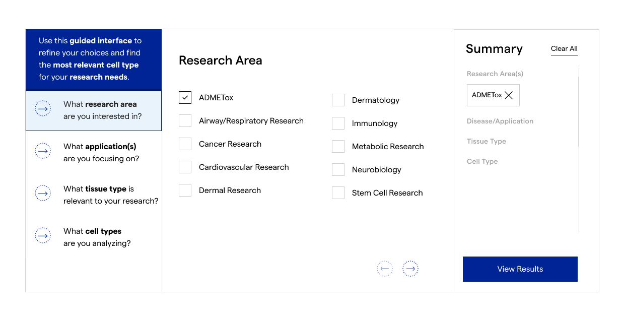
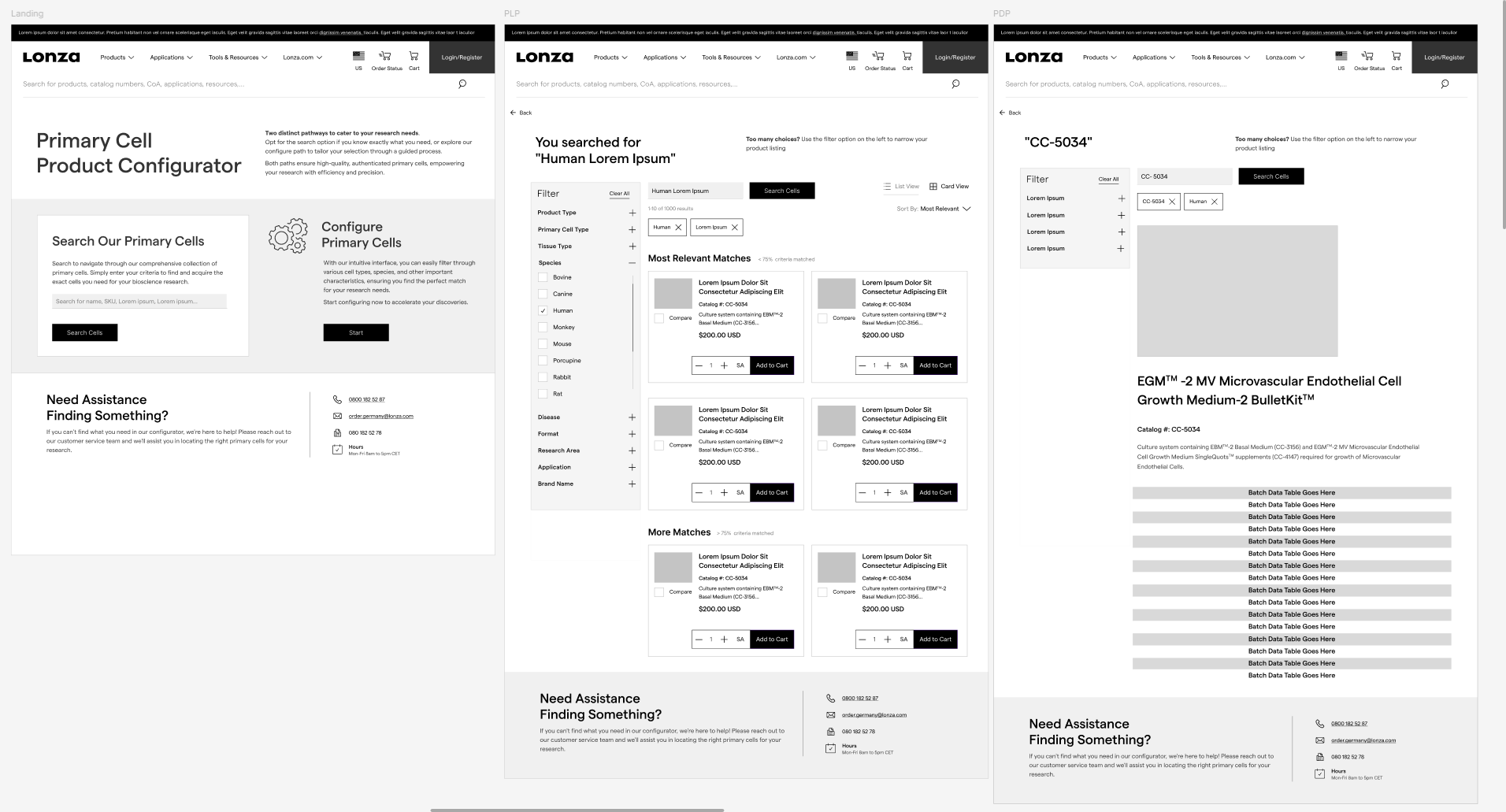
Path A · Guided Exploration
Research Area
↓
Application Type
↓
Product Category
↓
Filtered Results
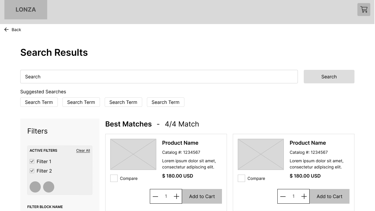
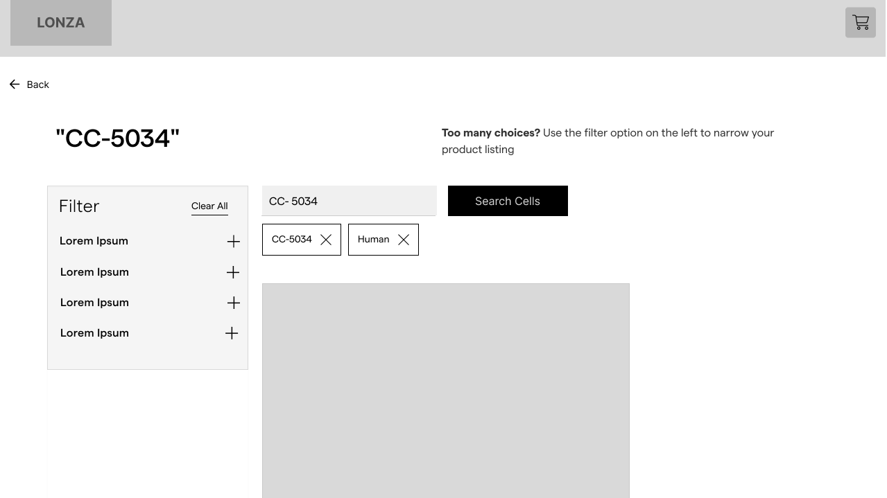
Path B · Precision Search
Direct Query
↓
Faceted Filtering
↓
Specification Match
↓
Confirmation
Both paths converge at a shared summary state — a selection review panel that lets users validate their choices before committing. This was the most requested missing element in research, and became the clearest differentiator in the final experience.
Designing the Experience
Structure before polish
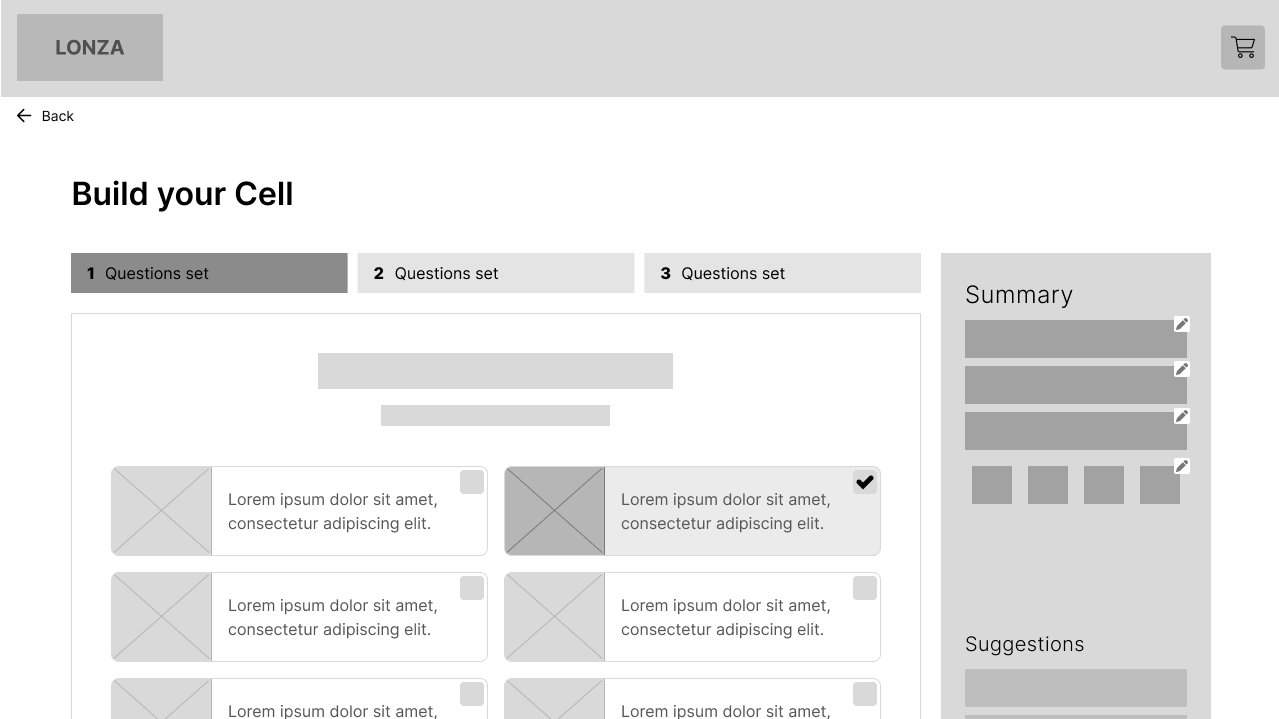
Wireframing prioritized flow integrity over visual detail. Early rounds were tested with users in low-fidelity to validate navigation logic and the transition between modes — before committing to visual design.
Key interaction principles carried through from wireframe to final UI: always show where you are, always show what you've selected, and never force a dead end — every state had a clear path forward or back.
System-level wireframes mapping the end-to-end flow from guided discovery through product selection and final configuration.
Exploration & Early System Thinking
Early wireframes explored multiple entry points, guided flows, and system relationships before converging on a structured dual-path model.
Core Design Principles
01
Always show where you are
Persistent step context and research area framing throughout. Step indicators replace breadcrumbs — forward progress, not history.
02
Always show what you've selected
The summary panel is persistent and live — updating with each selection, always visible, always editable before committing.
03
Never create a dead end
Every state has a clear path forward or backward. No confirmation walls. Selections are removable at any point without resetting the session.
Continuous Improvement
Closing the loop between analytics and design
Post-launch, I built a lightweight continuous improvement framework — connecting behavioral analytics (drop-off by step, session replays, search query analysis) to a structured UX review cycle. Rather than waiting for a major redesign, small, evidence-backed iterations shipped on a regular cadence.
User Behavior
→
Analytics
→
UX Review
→
Iteration
→
Release
- Defined key behavioral signals to monitor per pathway
- Established a bi-weekly review rhythm with product and analytics stakeholders
- Prioritized iterations using an effort-to-signal ratio rather than HiPPO input
- Documented decisions and their data rationale to create a living design history